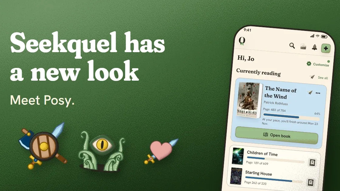
On the web it’s live now. On iOS and Android, it shows up in the next update.
Seekquel has a new look. The new default theme is Posy. It has a mossy green, softer titles, rounder corners and a little grain on the buttons. Painted art has replaced the old line icons.
My wife and I put a lot of evenings into this, more than I'd like to admit. We disagreed about colours. I changed my mind more than once, and at one point I was sure I'd ruined it. Here's how it got here, including the parts I got wrong.
It didn't start as a redesign. It started with a plant.
It started with the garden
The first thing in Seekquel with any personality was a small plant. You log your reading and it grows through its stages until it blooms.
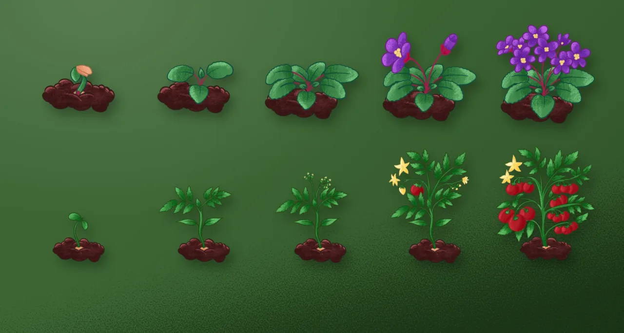
I thought of it as a small extra. It turned out to be the part people reached for. More readers add it to their home screen than any other card, even though it starts off.
The plants have grain in their shading and outlines a shade darker than their fill, never black. Once they were in, they showed me a problem I'd been ignoring. The buttons were flat and the icons were the same thin lines every app uses. I'd built a nice little garden inside a very tidy spreadsheet.
So I wondered what the whole app would look like if it all felt like the garden.
What your themes told me
Before changing anything, I looked at what you were already choosing. Seekquel has plenty of themes, and switching takes a few taps.
About 38% of the readers active in the last two months had picked something other than Classic. The rest were happy where they were, or never found the setting. That part is on me.
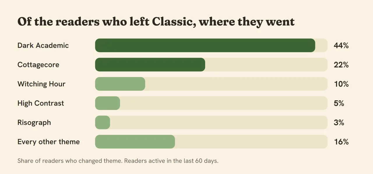
Dark Academic and Cottagecore take about two thirds of those choices. One is a candlelit library, the other a cottage with a pot of tea. Witching Hour came next, a seasonal theme that arrives every October.
I'd have guessed bright and loud, and I was wrong. Readers picked warm, bookish themes with a handmade feel. Hardly anyone chose something sleek.
That showed me what Classic was missing. It's clean, but it has about as much personality as a form.
What you said about the little touches
Two kinds of comments kept coming in, and they pulled in opposite directions.
Some of you pointed out that I keep adding visual things: plants, scenes, new ways to decorate a profile. Those comments were fair, and I read them twice. I'm not great at stopping.
Others wrote about the small moments, like the plant growing. Those were the parts people brought up unprompted.
We floated a profile card that shows your books on a real-looking shelf. People voted for it. I took that to mean you like an app that looks like something you could pick up.
So I stopped asking whether to add more. I asked how to make everything belong together. The fix is one palette, one way of drawing and one set of rules. A new plant, icon or button then looks like it came with the rest.
If you'd rather have a plain reading log, that hasn't changed. Cards still switch off, and you can ignore any part of the app you don't care about.
The colour, and why it's moss
The colour took the longest, and I'm still not sure I'd call it done.
The old brand colour was terracotta, which now belongs to Classic. For the new look I wanted the garden's green. It's a soft, slightly grey moss, with butter yellow for small accents.
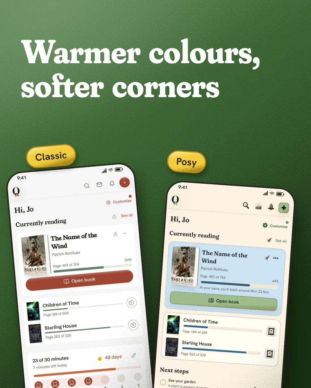
Green sits next to a book cover without fighting it. That matters in an app where covers are the brightest thing on every screen.
I got the type wrong first. I tried a thin, elegant serif for the titles, the kind on magazine covers. It looked great in a mockup and cold on a phone.
Beside the painted art it looked like a guest who had wandered in from another party. On a book card, the title even came out lighter than the text under it.
Fraunces in its soft cut is rounder and a bit goofy in a good way. It holds up at every size, and I rounded the corners to match. They're squircles, which look shaped by hand.
The grain
The grain is the detail I'm proudest of and the hardest to explain.
Buttons and chips in Posy have fine speckle shading. It packs in at the bottom right and thins towards the top left, as if light comes from there. The lit edge gets a few lighter specks.
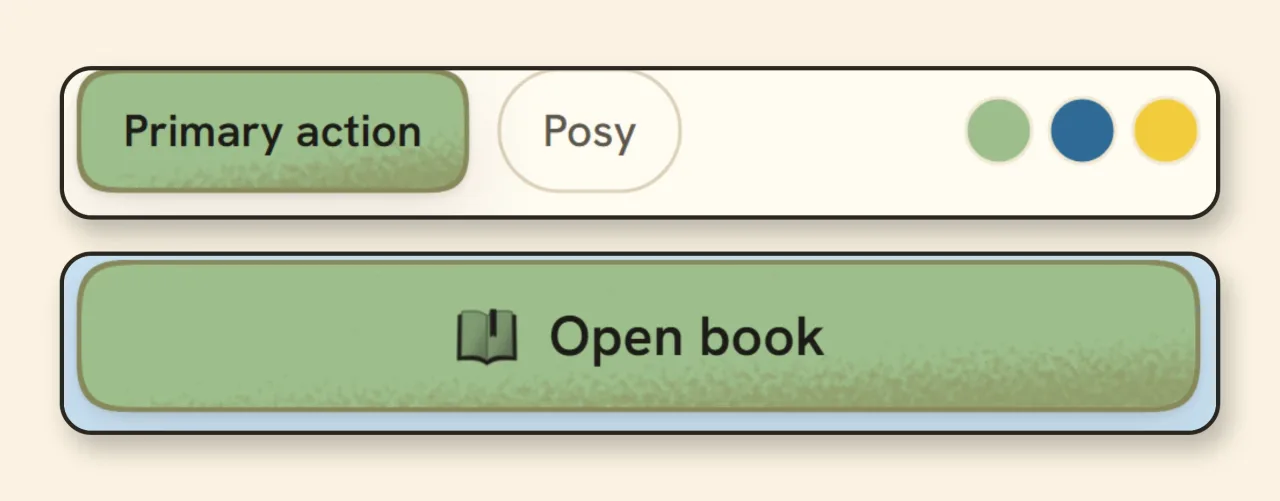
I'm strict about the rules, probably too strict:
Grain is shading, never a texture laid over a whole shape.
It stays inside the shape it shades.
Shadows fall only where one thing rests on another.
Lit edges are a lighter tint of the same colour, never white.
A smooth gradient looks like every other app, and grain looks like a printed page. It also gives every control a little weight without any shine. Dark mode follows the same rules, in a warm charcoal and moss instead of a cold black.
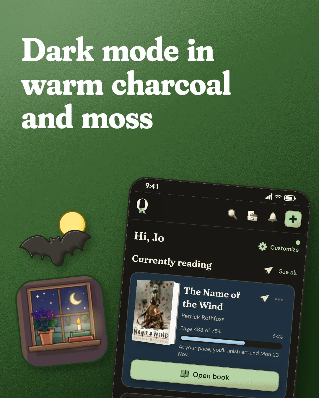
Painted icons, genres, moods and avatars
With a colour and a finish settled, the line icons had to go. A thin black icon beside a painted plant looked like it belonged to another app.
Every icon has a painted light version and a painted dark version, so it reads on both backgrounds.
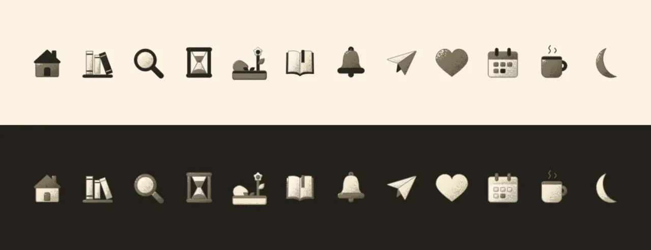
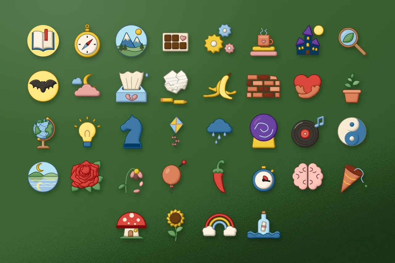
Genres were the part I enjoyed most. Each has its own small picture. Grimdark gets a crow on a sword and romantasy a heart pierced by a blade. Folk horror gets a stag skull wearing flowers, and LitRPG a pixel heart with health bars. A subgenre without its own picture borrows its parent's.
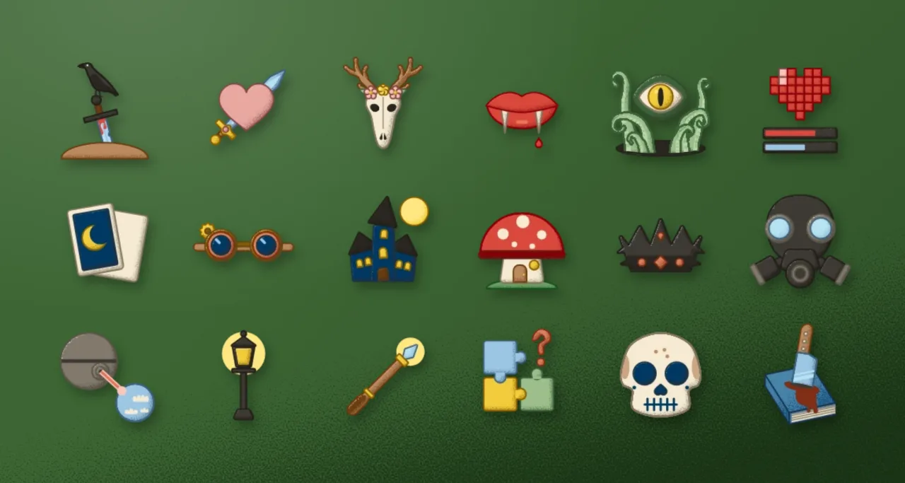
It turns out I have strong opinions about objects. Young Adult went through a lot of backpacks before it landed on a phone with chat bubbles. Literary Fiction went through a typewriter I couldn't stand before it became a fountain pen.
A few rules keep the set consistent. Outlines are straight and solid, so each drawing matches the app's straight borders. Faces stay off objects, except where a genre insists on a skull or a mask.
I check every picture at the tiny size you'll see on a phone. A detail that vanishes there isn't a detail.
Moods got the same treatment. Choosing how you want a book to feel now starts with a picture instead of a list. Some are a little silly. Bittersweet is dark chocolate, yearning is a message in a bottle, and funny is a banana peel.
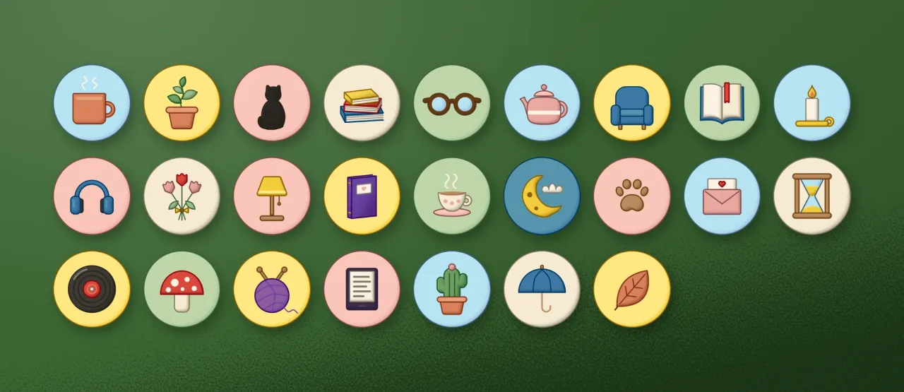
The default avatars used to be faces. Now they're objects on soft coloured discs, like a mug, a cat seen from behind or an e-reader. They're things a reader keeps nearby, and nobody's face is in them.
One window, light and dark
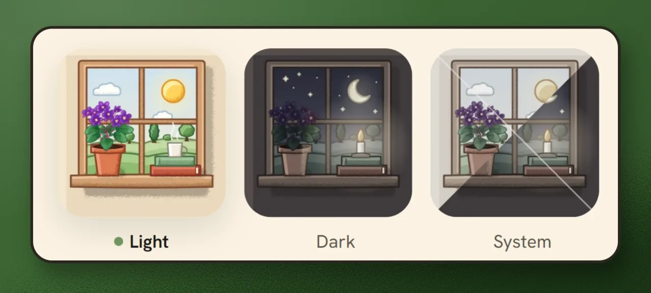
The Appearance screen has a scene now: a window with a violet, a mug of tea and some books. It's bright in light mode, with a candle and a crescent moon in dark mode. System splits the difference, half and half.
It's a small picture, but it's the first thing you see when you change how Seekquel looks. I wanted it to feel like the room you're about to sit in.
Your look is still yours
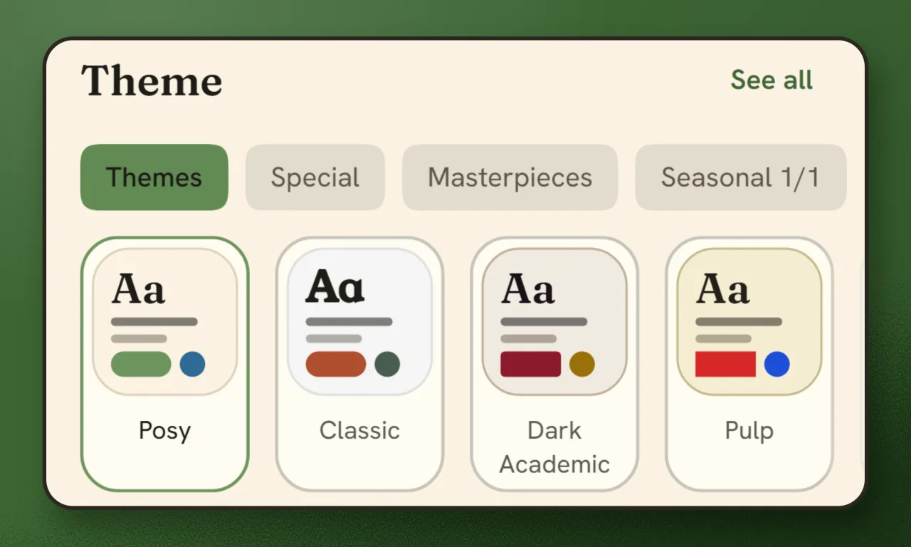
Posy is the new default. Classic is one tap away in Appearance, along with every other theme, the candlelit library and the cottage included.
Your books, shelves, reading history and settings haven't moved.
What I'd like to hear
It isn't perfect. A few drawings will bug me for a while, and I'm sure you'll spot things I missed. If a colour tires your eyes or something looks off, tell me on the feedback board. I read it.
I'll keep fixing one corner of the app at a time, with my wife's opinions close at hand.
The screens and art in this post are the app's own.